Office of Change Management (OCM)

California Governor's Office of Emergency Services (Cal OES)

• Product Management • Product Strategy • Information Architecture • UX App Design • Product Market Fit • Design System • Product Branding • Prototyping • Stakeholder Presentation •


Top

Overview

California Governor’s Office of Emergency Services (Cal OES) - serves as the state’s leadership hub during all major emergencies and disasters securing resources through the Federal Emergency Management Agency (FEMA).

The Challenge

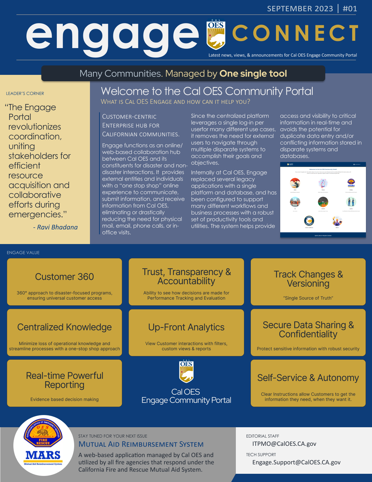
The California Office of Emergency Services (Cal OES) portal presented a classic case of government digital infrastructure that had evolved without user guidance—nine different application tiles with cryptic acronyms, each built by different vendors with competing interests and no centralized oversight. As one would expect in an organization where "UX" was still considered an unnecessary extravagance rather than a fundamental requirement, users were left to decipher an interface that prioritized departmental structure over human comprehension.

As the Solutions Architect (the deliberately vague title on my business card that allowed me to address user experience issues without alarming the bureaucracy), my role was to single-handedly bridge the gaps between fragmented programs, directorates, and technology teams. With the UX team recently downsized to just two survivors, I took on the challenge of creating coherence from chaos—designing a unified experience across disparate systems while simultaneously educating stakeholders on why this mattered in the first place.

After speaking at length with the client and understanding her needs, our team made a determination focusing on the Driver app so that there would be enough information for potential investors.

Business Context

Market Reality: Government agencies aren't exactly known for their cutting-edge technology. Legacy systems were creating inefficiencies at critical moments when time and clarity matter most.

Key Metrics That Mattered:

Quickly we had realized that the research was inconsistent between teams resulting in prototypes which did not match the approved flow.

  • User adoption rates (catastrophically low)
  • Support ticket volume (catastrophically high)
  • Successful onboarding completion (let's just say "opportunities for improvement")
  • Time-to-first-grant-application

Business Goals

  • Modernize without traumatizing existing users
  • Reduce operational costs through self-service
  • Increase grant application volume and success rates
  • Meet strict compliance requirements without sacrificing usability

Problem Definition

After weeks of user interviews and system analysis (and enough coffee to float a small battleship), I identified three critical problems that needed immediate attention:

  1. Acronym Alphabet Soup: The portal was a showcase of government's love affair with impenetrable acronyms. HAMRRS? CWMP? LEMA? I watched users stare at these mysterious circles like they were decoding ancient hieroglyphics. "I just want to apply for a wildfire grant," one user told me, "not play a game of governmental Wheel of Fortune."
  2. Design by Committee (of Competitors): Each application had been built by different tech teams—some actually competitors—with no centralized oversight. The result? A user experience that gave you whiplash as you bounced between completely different interfaces, navigation systems, and workflows. Left menu, top menu, no menu... it was the digital equivalent of driving through Boston with GPS turned off.
  3. Brand Identity Crisis: The portal had all the visual cohesion of a garage sale. No consistent logo, color scheme, or design language to build trust or recognition. In an emergency services context, this wasn't just an aesthetic problem—it actively undermined confidence in the system when people needed it most.

“This landing Page was super easy to use - I didn't have to guess which bubble to click” -Mark S.

Discovery Process

Being the unicorn product person—part designer, part researcher, part manager, part diplomat, and occasional therapist for frustrated users—I knew that solving this entrenched mess would require more than just pretty buttons and a color palette.

I rolled up my sleeves (metaphorically; it was summer in Sacramento) and dove into the user experience abyss:

  • Earnings
  • Scheduling
  • Communication

User Research

Conducted 27 stakeholder interviews, during which I heard variations of "I hate this system" in enough different ways to compile a thesaurus

  • Shadowed real users as they navigated the portal, watching their expressions morph from confusion to frustration to what I can only describe as existential despair
  • Analyzed support tickets that read like desperate pleas for help ("WHERE DO I CLICK???" being a recurring theme, all-caps included)
  • Created journey maps that looked less like user flows and more like crime scene investigations

Heuristic Evaluation

Conducted a comprehensive analysis using established Laws of UX and design principles to identify specific issues with the portal

  • Evaluated common patterns across government interfaces to identify what worked and what consistently failed users
  • Applied Jakob Nielsen's 10 Usability Heuristics to provide objective evidence of interface problems, giving stakeholders a framework they could understand
  • Documented violations of Fitts's Law, Hick's Law, and the principle of recognition over recall that were hampering user efficiency

Cross-Functional Diplomacy

Armed with mountains of evidence and a vision for something better, I prepared to champion the voice of users in a system that had forgotten they existed.

  • Built strategic partnerships across departments to gather support for a more cohesive user experience
  • Held collaborative workshops with IT managers to align on user-centered improvement opportunities
  • Had 14 cups of coffee with IT managers who insisted their system was "working as designed" (which was technically true, if the design goal was confusion)

Strategy Development

With a diagnosis that would make any product doctor prescribe immediate intervention, I developed a strategy that balanced political realities with what users actually needed.

Vision: Create a central platform connecting Californians to state and local municipalities, making grant funding more accessible by modernizing government legacy software with a SaaS CRM.

Strategic Pillars

Speak Human, Not Government - Replace bewildering acronyms with clear, descriptive language that actually tells users what each service does

  • Design for Clarity - Simplify the experience so users can find their specific application without needing an advanced degree in government organizational structures
  • Build a Brand Identity - Develop a cohesive visual language that builds trust and recognition, starting with a proper logo (revolutionary, I know)
  • Establish a Center of Excellence - Create standards and governance to wrangle the competing technology teams (a bit like herding very opinionated cats)

Roadmap Prioritization

Phase 1 focused on the grants management portal, targeting the highest-volume user journeys with the most significant pain points. I used a weighted scoring model to prioritize initiatives based on:

  • User impact (40%)
  • Technical feasibility (25%)
  • Business value (25%)
  • Regulatory requirements (10%)

Cross-Functional Solution

As a product unicorn (not the billion-dollar kind, just the "does-everything-because-nobody-else-will" kind), executing this transformation meant wielding influence without authority—my favorite sport in the corporate Olympics.

Brand Development

  • Created an actual logo for the portal after convincing stakeholders that "yes, even government websites need visual identities" and "no, an official seal isn't the same thing as a logo"
  • Developed a cohesive color system that wasn't just red, white, and blue (revolutionary, I know)
  • Established brand guidelines that even competing vendors had to follow, which required diplomatic skills I didn't know I possessed

Program Management Office (PMO)

Helped establish a Center of Excellence, which sounds fancy but really meant "adults in the room making sure things don't go sideways"

  • Created governance processes that balanced vendor independence with user experience consistency (imagine herding cats, if the cats all had separate budgets and contractors)
  • Implemented cross-team design reviews where I perfected my "disappointed but not surprised" facial expression

User Experience Overhaul

Phase 1 focused on the grants management portal, targeting the highest-volume user journeys with the most significant pain points. I used a weighted scoring model to prioritize initiatives based on:

  • Replaced cryptic acronyms with descriptive labels, fighting the valiant fight against "but everyone knows what HAMRRS means!" (Narrator: They did not.)
  • Simplified navigation to focus on user goals rather than organizational structure, a concept so radical you'd think I'd suggested we scrap the entire government
  • Created consistent patterns across applications despite their different underlying technologies, which felt like getting Republicans and Democrats to agree on a lunch order

Stakeholder Wrangling

Phase 1 focused on the grants management portal, targeting the highest-volume user journeys with the most significant pain points. I used a weighted scoring model to prioritize initiatives based on:

  • Built alliances with key decision-makers through a strategic application of data, persistence, and occasionally bringing donuts
  • Translated user needs into government-speak, which is its own special language where simple concepts go to die
  • Managed competing vendor interests, an exercise similar to refereeing a family holiday dinner where everyone's had too much wine

Outcomes & Impact

Beyond the numbers, we transformed how Californians access critical emergency services funding. The simplified interface, intuitive workflows, and modern technology stack created a platform that actually helps people during their time of need—instead of becoming yet another obstacle.

User Base

  • 545.5% increase in subrecipient user base within just 4 months after launch
  • 75% decrease in typical support tickets despite more active users
  • 203% increase in successful onboarding completion rates

Lessons Learned

After surviving this project with most of my sanity intact, I walked away with some hard-earned wisdom:

  • Acronyms are the enemy of usability. Government loves its alphabet soup, but users just want plain language. The moment I replaced "CWMP" with "California Wildfire Mitigation Program," comprehension skyrocketed. Shocking, I know.
  • Centers of Excellence actually work. Establishing standards and governance sounds bureaucratic (oh, the irony), but it was the only way to herd our competing vendors toward a unified experience.
  • Brand identity matters, even in government. Creating a recognizable, professional visual system wasn't just cosmetic—it fundamentally changed how users trusted and engaged with the platform.
  • Politics and product are inseparable in government work. Technical solutions only succeed when you've navigated the human ecosystem they'll live in. I became part product manager, part diplomat.
  • Success metrics tell the real story. When support tickets drop by 75% while users increase by 545.5%, you know you've hit on something that works. Numbers don't lie, even in government.

In Closing

What began as a bewildering maze of government services transformed into an actually usable platform that connects Californians with critical resources when they need them most. And at the end of the day, that's what makes all the bureaucratic battles worthwhile—knowing real people can now access emergency services without first having an emergency of their own trying to navigate the website.